Examples: Graphs and Charts: Medium Level Descriptions
On this page you will find examples for Medium Level Descriptions for Graphs and Charts. Depending on the context, so may require a long description. To learn more go to Complex Images and Long Descriptions
Graphs and charts can be particularly tricky to describe, as they can convey quite a bit of information. Do your best to describe the essential pieces of information to the reader, and ask someone else for help if you need it.
The following two graphs and charts are from the book Age of Discovery by Ian Goldin and Chris Kutarna. Context: The book is a non-fiction work discussing the relevance of the renaissance to the modern age. It was written by scholars, but for a general audience. Therefore, the descriptions are detailed, but do not presume any prior knowledge other than what is offered in the text.
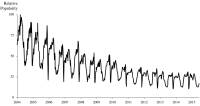
[Caption]"Figure 1-2: Google searches for “globalization” have been declining for a decade."
[Alt-text] A line graph depicting the Relative Popularity of searches for the term globalization. The horizontal x-axis shows the years 2004 to 2015, and Relative Popularity appears on the vertical y-axis, ranging from 0-100. The line has many peaks and valleys, but trends steadily downwards, with high points trending down from 100 in 2004 to around 30 in 2015, and low points trending down from 40 in 2004 and 20 in 2015.
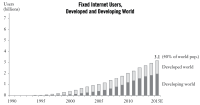
[Caption] "Figure 2-8: In just 20 years, almost all humanity has been connected, by voice or data." [Alt-text] A bar chart titled "Fixed Internet Users, Developed and Developing World". The vertical y-axis shows number of users in billions, numbered from 0-7; the horizontal x-axis shows years, from 1990-2015. No bars appear until 1994, then growth steadily increases until 2015. Users reach 1 billion around 2005, 2 billion around 2010, and 3.1 billion, or 40% of the world’s population, in 2015. From 1994 to 2006, the number of users in the developing world is less than the number of users in the developed world. From 2007-2009, the numbers are approximately equal. From 2010 to 2015, The number of users in the developed world is less than the number of users in the developing world.
These next graphs are from the book The Great Leveler: Violence and the History of Inequality from the Stone Age to the Twenty-First Century by Walter Scheidel. It is a political science book that is quite academic in tone, which is to be expected as the book was published by a University press (Princeton).
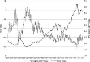
[Alt-text] A line graph indicating a negative correlation between per capita GDP/wage and real wage, with the two meeting in the approximate year 1547 at approximately 0.5 real wage and 1.5 per capita GDP/wage. The late 1700's indicates a peak in per capita GDP/wage and the lowest point indicated in real wage.
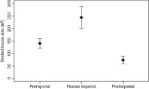
[Alt-text]The graph portrays the preimperial (~125-160 metres square), Roman imperial (~200-300 metres square), and postimperial (~60-80 metres square) roofed house size.


