This is an old revision of the document!
Medium Images
On this page you will find examples of medium image descriptions.
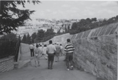
This is the first image of a book where all the images are in black and white. The cemetery is mentioned in the surrounding text.
[Alt-text] All images in this book are black and white photographs. A dozen people walk downhill away from the camera on a wide cement path. Stone walls and thick trees line either side of the path. In the distance, the cemetery is visible on a low hillside below the horizon.
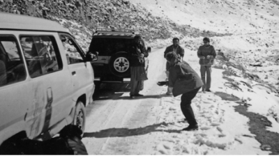
This image is from All we Leave Behind, by Carol Off. It is a non-fiction, journalistic style book written for a general audience. The images in the text are from her time in the Middle-East.
[Caption] "A snowball fight during the trip to Mazar-e-Sharif. Asad and Sher Shah flank our driver."
[Alt text] Two vehicles are parked, one in front of the other, on a snowy rural road. To the left of the road is a rocky hill. To the right of the road is a snow-covered clearing. Carol stands near the closest vehicle with her back to the camera. She ducks down slightly. By the other vehicle, Asad, the driver, and Sher Shah stand facing Carol. They both smile as one packs a snowball in his hands.
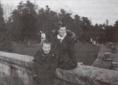
This image is from Gerry, Get Your Gun by Gerry Bracewell. It appears with a caption. When you have a book with multiple images of the same person, only describe what is different, and remember to include age when they visibly age. For more on how to describe age see Skin tone, Gender, and Age
[Caption]My Friend Elsa and me in Vancouver. Elsa and I decided to change our names as a joke. Elsa became Jacquie and I changed my name from Ethel to Gerry. I preferred Gerry, so I kept it.
[Alt-text] Gerry and Elsa smile widely and pose at the wall of a stone bridge overlooking a road along a nearby park area. Cars drive along the road below them. Gerry sits on the wide worn stone ledge of the bridge and looks off to the right. Elsa stands before her and leans back against her friend and looks at the ground. They have their hair curled and pinned back away from their faces and wear dark gloves, and dark winter jackets with fur trimmed hoods that are worn down.
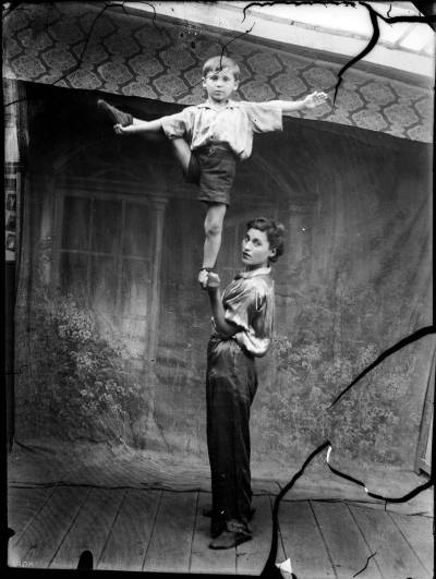
This next image is from Bone Mother by David Demchuk. It is a horror fiction book made up of connected short stories; each chapter is named after a person and includes a vintage photograph. All of the images are cracked, torn, or decaying, and since this repeats in every picture, this sort of information should be included only in the first image description. Exceptions were made when a photo was notably decayed.
[Alt text] Portrait of a young woman and boy, standing on a wood panelled floor in front of a cloth backdrop which has been painted with windows and flowers. The woman stands with her side to the camera and looks forward over her shoulder. She holds the boy up in the air with one foot in her hand. His arms are extended out at his sides, and he holds up his other leg with one hand. The woman wears smooth flowing pants and matching top with her long dark curly hair pinned back. The boy wears shorts and a loose button up shirt. They both have a light skin tone.
When you are describing a person's movement, you do not have to explain in detail where their limbs are, only the movement itself.
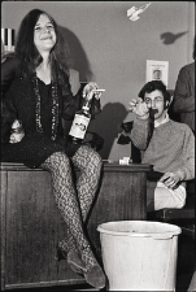
[Alt-text] Janis sits on the edge of a desk and Simon sits on a chair behind the desk. Janis props one hand on her hip and smiles. She holds a wine bottle on her leg and a cigarette between her fingers. She wears a short black dress over lacy tights, and long beaded necklaces. Simon tosses a paper airplane up into the air before him. He wears a sweater over a collared shirt.
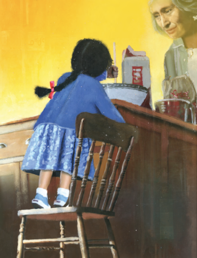
This next image is from the children's book Missing Nimâmâ by Melanie Florence. Note that the description refers to "the fry-bread dough", instead of being vague or general - this is because that information is given in the text. Therefore, it is best to include it. Another thing to note is the description of the Cree word "nôhkom" (it is written very faintly) - a glossary was provided at the start of the book, and since the book is for children, it is helpful to define the words that appear on the page. To learn more about describing for Children's Books see Children's Picture Books & Illustrated Books
[Alt text:] Kateri stands on a wooden chair before a wooden counter, and stirs the fry-bread dough with a wooden spoon. Her Grandmother looks down at her from the opposite side of the counter and watches Kateri stir. The Grandmother holds a bag of flour. On the countertop is a carton of milk and a measuring cup. The Cree word for nôhkom, which means grandmother, appears near Kateri's head.
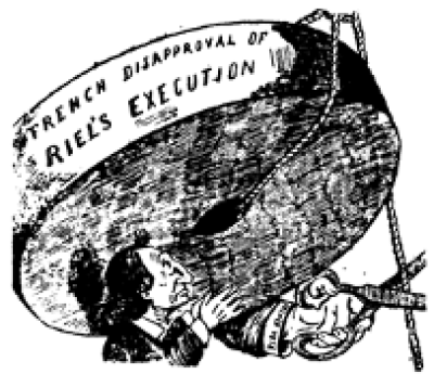
For political cartoons, be objective, stick to the facts, and remember details matter and there is a lot of visual language in these types of images.
[Alt-text] A political cartoon of Sir John underneath a large round weight. He holds it up with both of his hands with a deep frown. He has a light skin tone, a long hooked nose, and long black hair pulled back into a low short ponytail. He wears a dark coloured suit. The weight has words written on it that read: “Trench disapproval of Riel’s execution”. A single rope is tied around the center of the weight and hangs down the far side. A large hand with a suit sleeve reaches from behind the weight with a pair of scissors to cut it. Text along the sleeve reads: “French Vote”.
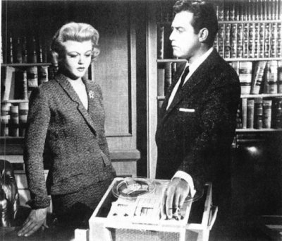
When describing objects in images, it is okay to compare them to a common object.
[Alt-text] Raymond and Angela stand in an office and look down towards a large tape recorder on a desk. It is the size of a small suitcase and has two round plastic audio reels and large buttons on the front. Raymond stares at Angela as he adjusts a switch on the recorder. Angela looks down at his hand with her mouth slightly open. Angela wears a low-cut grey blazer with a matching skirt. Raymond wears a black suit with a white dress shirt, black tie, and white pocket square. Behind them, bookshelves full of leather-bound books line the wall.
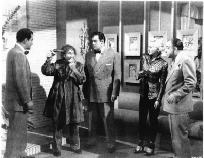
Some medium images may appear busy or complex, but they are not complex images. Context is always key. Ask yourself: "What is this image telling the reader?". Break the image down into smaller parts and organize in a logical manner. In this case, Harpo is the main focus, then the people, and the background does not require much detail.
[Alt-text] Four people stand in a living room and watch Harpo put a handgun to his temple as he bites into an apple. Harpo is shorter than the others and has greasy curly hair and wears a crumpled long coat and matching dark trousers. He stands between two men with dark hair wearing grey pinstripe suits with black bow ties. The man to the left is Raymond. A blonde woman and an older man in a grey suit stand a few feet away from Raymond. The woman leans backwards with one arm raised and wears a patterned button-up satin blouse with dark trousers with heels. The wall behind them is lined with two rows of four pictures above a light-coloured couch. The opposite wall is made of brick.
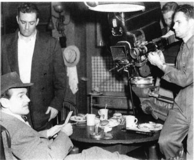
Only describe things as "left" or "right" if it is important to the meaning of the image. In this next example, using "left" and "right" helps describe the spatial information of the image that is more clear and concise. If you overuse this method, it can make your descriptions too complicated and harder to follow. If you do use this method, it is always for the perspective of the viewer.
[Alt-text] A cameraman points a camera at Raymond and another actor. Raymond stands on the far left and stares down at the ground. The other actor sits sideways at a table in front of him. The table is covered in dirty white dishes. The cameraman stands on the right at the opposite end of the table. Raymond wears a boxy suit jacket and a white button-down shirt. The seated actor has a pointed chin and a pencil mustache and wears a dark short-brimmed hat and grey suit.
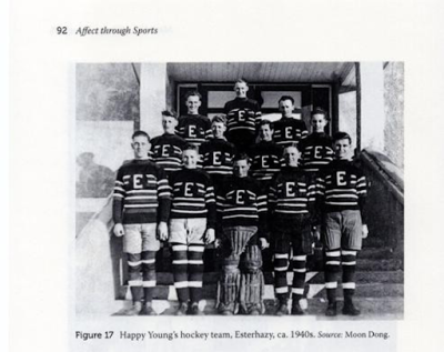
For rows of people, group like with like, and it is okay to be a bit more repetitive in these descriptions across the book as per the nature of these image types.
[Caption] Figure 17: Happy Young's hockey team, Esterhazey, ca. 1940s. Source: Moon Dong.
[Alt-text] A group photograph of the twelve members of Happy Young’s team. They stand on a set of stairs in front of a set of double doors. The team all appears to be young men. They all have a light skin tone and short haircuts. They wear uniforms of black sweaters with thick white stripes across the middle. There is a large white E in a black circle in the center of each sweater. The boys in the front row wear shorts that reach mid-thigh over black stockings with three white stripes. The boy in the center of the front row wears black goalie pads on his legs.
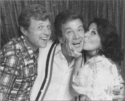
For people posing in a row, you can get a bit more creative as long as you are clear. When describing what people look like, please describe them in order they appear in the image.
[Alt-text] Wink poses between Steve and Eydie. Steve leans toward Wink and smiles at the camera. Eydie grabs Winks face and kisses him on the cheek. Wink gives a wide open smile to the camera and wraps an arm around her waist. Steve has short curly blonde hair, and wears a collared shirt with a plaid pattern. Wink wears a cardigan with a striped border over a white collared shirt. Eydie has curly dark hair that hangs just below her shoulders. She wears a light floral blouse with bell-like sleeves. She has glossy, manicured fingernails.
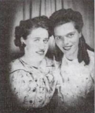
This image is from Gerry, Get Your Gun by Gerry Bracewell. When you have a book with multiple images of the same person, only describe what is different, and remember to include age when they visibly age. For more on how to describe age see Skin tone, Gender, and Age
[Caption] Isobel and me. (I am on the right)
[Alt-text] Isobel and Gerry lean their heads together and pose for the camera. They both smile. Isobel has her dark hair curled and pinned up into a sleek updo. Gerry wears her hair curled and half pinned back at the temples with the back section curled into ringlets down to her collarbone. They both wear light-coloured floral blouses with a delicate pattern and dark lipstick. The photograph has a vignette effect, with a dark, blurry shadow around the border of the image.
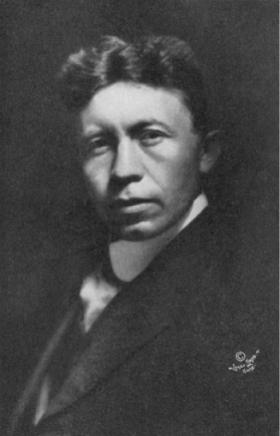
Portraits are fairly standard. It is okay if they are a bit repetitive, as that is the nature of the image type.
[Alt-text] A portrait of Vilhjalmar Stefansson. He looks into the camera with a neutral expression. He has a medium-light skin tone with dark, wavy hair that is parted down the middle and dark, and hooded eyes. He wears a high-collared white shirt under a black suit jacket with a satin-like lapel.
Graphs/Charts
Graphs and charts can be particularly tricky to describe, as they can convey quite a bit of information. Do your best to describe the essential pieces of information to the reader, and ask someone else for help if you need it.
The following two graphs and charts are from the book Age of Discovery by Ian Goldin and Chris Kutarna. Context: The book is a non-fiction work discussing the relevance of the renaissance to the modern age. It was written by scholars, but for a general audience. Therefore, the descriptions are detailed, but do not presume any prior knowledge other than what is offered in the text.
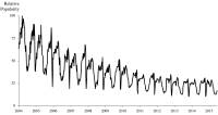
[Caption]"Figure 1-2: Google searches for “globalization” have been declining for a decade."
[Alt-text] A line graph depicting the Relative Popularity of searches for the term globalization. The horizontal x-axis shows the years 2004 to 2015, and Relative Popularity appears on the vertical y-axis, ranging from 0-100. The line has many peaks and valleys, but trends steadily downwards, with high points trending down from 100 in 2004 to around 30 in 2015, and low points trending down from 40 in 2004 and 20 in 2015.
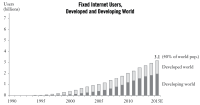
[Caption] "Figure 2-8: In just 20 years, almost all humanity has been connected, by voice or data." [Alt-text] A bar chart titled "Fixed Internet Users, Developed and Developing World". The vertical y-axis shows number of users in billions, numbered from 0-7; the horizontal x-axis shows years, from 1990-2015. No bars appear until 1994, then growth steadily increases until 2015. Users reach 1 billion around 2005, 2 billion around 2010, and 3.1 billion, or 40% of the world’s population, in 2015. From 1994 to 2006, the number of users in the developing world is less than the number of users in the developed world. From 2007-2009, the numbers are approximately equal. From 2010 to 2015, The number of users in the developed world is less than the number of users in the developing world.
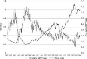
These next graphs are from the book The Great Leveler: Violence and the History of Inequality from the Stone Age to the Twenty-First Century by Walter Scheidel. It is a political science book that is quite academic in tone, which is to be expected as the book was published by a University press (Princeton).
[Alt-text] A line graph indicating a negative correlation between per capita GDP/wage and real wage, with the two meeting in the approximate year 1547 at approximately 0.5 real wage and 1.5 per capita GDP/wage. The late 1700's indicates a peak in per capita GDP/wage and the lowest point indicated in real wage.
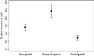
[Alt-text]The graph portrays the preimperial (~125-160 metres square), Roman imperial (~200-300 metres square), and postimperial (~60-80 metres square) roofed house size.
