This is an old revision of the document!
Alt-Text Q&A
It can take a lot of practice to get good at writing Alt-text, and even then we can sometimes hit a wall when describing images. This section is to post any of your problem images you are stuck with describing, or any images you have in general about Alt-text and Image Descriptions. All other eText questions can go on the general Q&A page.
When posting a question please include:
- Title and location of issue/image
- Image and context
Here is a video tutorial of how to post a question and image on the wiki.
Q: In my long description for this image, do you think the lists of attributes above each character's head would be better as four individual lists or as a table? From You Look Like a Thing and I Love You.
Q: Krav Maga often switches between close-ups and non-close-ups, and I need a good phrase for the non-close-ups! Camera angles are something I've puzzled over with other books, too.
A: Camera angles often don't work in most books, unless they are the more common ones (e.g. close up, ariel shot). Even with using the phrase close-up you would need to add more information for the reader to understand what it is a close-up of (a person's face? a person's hand? a cat sleeping on a couch?).
Context is also a big factor! The context of the book is that it is an instructional book on how to practice Krav Maga. This tells us we want to use simple and direct language, and that the important part of the image is the body poses and how they change.
When you are describing an image on its own (not in a sequence), stick to plain direct language. For example: The full body of the fighter is in the frame of the photo. The fighter is visible from the waist up. Photo looking down from above.
Sometimes the angle is implied in the description. For example, Two fights stand face to face a few feet apart…
When you are dealing with images that switch camera angles in the sequence, again keep is simple and direct. You can also use film language such as Pull into the fighters from the waist up. and Pull out to the two fighters in full figure.
If you have any specific images you are struggling with, please post them here.
I will pull together this information and put it in the glossary for you as well.
Q: For this image in The Forest Dwellers, I just can't decide which order the elements should be described in. Here's the image, its caption, and my three drafts. (This is a Human Narration book.) What do you suggest and why?
1. One chimpanzee jumps over another chimpanzee that sits inside an outdoor enclosure. The chimpanzee who jumps spreads its arms wide. The chimpanzee who sits looks up and touches its head with one hand. The enclosure has a wooden frame with wire walls and sits atop a platform. In the background are leafy trees.
2. A chimpanzee sits inside an outdoor enclosure while another jumps above it. The chimpanzee who sits looks up and touches its head with one hand. The enclosure has a wooden frame with wire walls and sits atop a platform. The chimpanzee who jumps spreads its arms wide. In the background are leafy trees.
3. A chimpanzee sits inside an outdoor enclosure while another jumps above it. The enclosure has a wooden frame with wire walls and sits atop a platform. The chimpanzee who sits inside looks up and touches its head with one hand. The chimpanzee who jumps above it spreads its arms wide. In the background are leafy trees.
A: Most of these options are good for eText, but since this is for Human Narration, we wanna keep the description to 1-3 sentences so it can fit into the time constraints of the medium. This means we can get ride of some of the details and really narrow it down more. Seems like there are three main things happening in this image to remark on:
- Chimp in square enclosure on a platform
- Chimp jumping over enclosure
- They are outside
We have to sacrifice details to fit into the constraints of Human Narration. This means finer details like the chimps arms and what the cage is made of can be cut and/or combined into one sentence to be clearer and more direct.
A chimpanzee sits in a square outdoor wire enclosure and looks up as another Chimp jumps overhead [took your option 3 first sentence and added some words]. The enclosure is on a raised wooden platform with leafy trees in the background. [condensed the info about the enclosure and where it is to one sentence].
The option above is ideal for Human Narration ID. Let me know if you need more clarification.
Q: In 117 Things You Should F*#king Know About the World, there is a topographical map with pretty much no context. It acts as a cover page for Chapter 5: Environment. There is no information about it in Chapter 5. We have already decided its not decorative because it’s cited in the Art Credits section and apparently it gives extra meaning (which I'm not clear on in this case). The book is for a general, adult audience and does not go into detail about any of the 117 topics it covers.
I can’t figure out how much I need to describe or how to organize it because it’s not focused on anything in particular. I’ve tried by quadrant, I’ve tried three horizontal rows, I’ve tried by design element (e.g. high points, low point, black squares, thick lines, protractor-like thing in the corner)… it all seems messy. What are your thoughts?
A: There is no need for a long description for this one, as the finer details are not important. In this book, these images are there mainly for an additional design element that adds to the experience of reading the book, so only a simple or medium level description is needed. So just a general overview of the image is enough in this case.
For example: A digital illustration of a topographic map. The ground is a light green with an overlay of swirling dark lines that indicate the shape of the grounds surface and a dotted grid that divides the map into dozens of square areas.
I can understand why you are struggling with them as being decorative. In this context, they are cited in the book and add to the reading experience. If we removed them the reader would loose access to part of the book. We are not editors, and our aim to reformat the book and keep it as close to possible to the original.
Q: The book 117 Things You Should F*#king Know about the World has a lot of images that use a red and green colour scheme. In some, the colours match what the images would look like in real life; in others, the colours seem like they are just differentiating elements of the image.
I understand that we indicate the type of image at the start of the description. Is it more accurate to say a “colour digital illustration” or a “red and green digital illustration” (suggesting use of colour like black and white or sepia-toned images) or something else? I feel like if I call these colour images, that it sets the expectation for full-colour, but I also don’t want to totally ignore the colour because it seems like a design choice that might be part of experiencing the book.
Also, for the images where the red and green is arbitrary, when should I describe which elements are which colour? (Ugh. I've tried rewriting this question several times and even slept on it, and it's still not coming out quite right…)
Example where the colour makes sense:
Example where the colour is arbitrary:
A: Red and Green Illustration is good. This book is mainly this style of illustration, so you only have to state it in the first image, or when the image type changes. Let me know if you need more clarification on this.
Q: Excel spreadsheets in Teaching Kids to Buy Stocks
In Appendix B, the author has a few screenshots demonstrating a tutorial on doing basic calculations in Excel. The first image shows the menu bar for Excel, and then the ones after show just the table. I think it would make sense to make a table for the last couple photos, but I'm not sure what to do about the first one with the menu bar. Here's some of the text describing the first image.
For those unfamiliar with Excel, here’s a crash course on basic calculations.
Entering the = sign into a cell lets Excel know you want to do a calculation or reference another cell.
Example: To reference another cell (cell A1), enter “= A1” into another cell. That cell will display the same thing that is displayed in A1. Entering “= A1 + A2” will give you the sum of A1 and A2. This works for addition and subtraction. Use * for multiplication and / for division.
In the following image, you’ll see the calculation for 1% interest in the “formula” window, referencing cell B2 as the beginning value multiplied by .01.
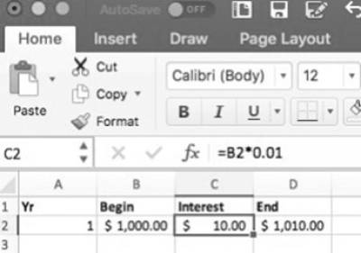

A: These types of descriptions should read like step-by-step instructions that include spatial and navigational information that can aid a screen reader.
You have the right instinct here, and the surrounding text does a lot in this example to tell us what to describe. Remember, context is always key! It is not important to the purpose of this image for the reader to know every single option listed in the screenshot, as it is A) not important to the meaning of the image in this context, and B) would be overwhelming to describe and create a confusing description. The text proceeding the first image reads: In the following image, you’ll see the calculation for 1% interest in the “formula” window, referencing cell B2 as the beginning value multiplied by .01. This paired with the clear instructions you already shared in your question from the text we know the only thing that needs to be described is the following:
- The calculation in the formula window
- The table in the excel sheet
Also, in this example we should use either MathXL or describe the equation in plain language.
If we are going to describe your first example following these guidelines the long description would be something like the following:
Screenshot of an excel spreadsheet. In the formula window the following equation is written: "equal B2 multiplied by 0.01." The data in the table cells are as follows:
[insert accessible table of data]
For the second image with have the text In the following image, you will see adding B2 and C2 for our ending value. So we know in this context the following is the most important:
- equation in formula window
- table in excel sheet
Following the same advice we would get a long description like the following:
Screenshot of an excel spreadsheet. In the formula window the following equation is written: "equal B2 plus C2." The data in the table cells are as follows:
[insert table of data]
Follow the same guidelines for all the images in this section.
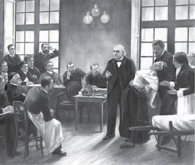
Q: Painting Title in The Body Keeps the Score.
This painting is in Chapter 11. The title of the painting isn't mentioned in the caption or surrounding text, but I found from a Google search it's a famous painting called "A Clinical Lesson at the Salpêtrière". Can I add the title to my alt-text description even though it's not mentioned in the book?
A: Yes, you can do that.
Q: Not sure if need Long Description for a photo in The Body Keeps the Score.
This photo appears in Chapter 7. Based on the context, it's a photo shown to abused children to record their interpretation of what's happening in the photo. There's no caption or much description of the photo in the surrounding text, although it seems important since the interpretations point out many details. My alt-text for it is somewhat lengthy to include these details, and I'm wondering if it would be appropriate to make a long description instead.
A: Given this context, this image will need a long description. You should start with a general description of the full image (think of it like medium alt-text) to establish the space and generally where things are, but do not go into too much detail. Then divide it into sections, and use meaningful lists for each section to add those finer details.
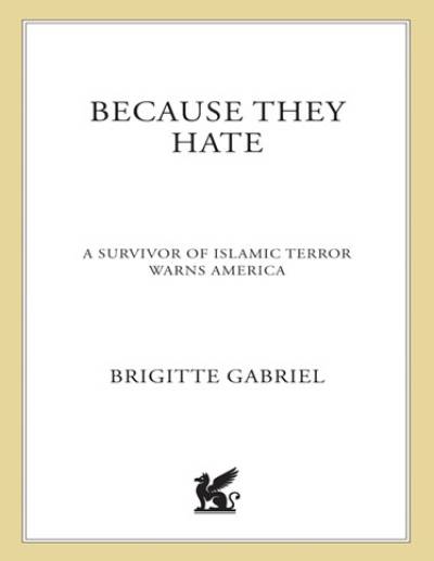
Q: Not sure if I have a cover image for Because They Hate…
When I open the eBook in Thorium, there is no cover image. However, the Word doc came with a cover image and my Thorium menu shows a thumbnail of that same cover image. Should I still describe it even though it doesn't match what I see in the eBook? It also looks nothing like the cover images I see online, so I wonder how helpful it is for allowing a reader to engage in a discussion about the cover. Here's what I see in the Word doc and the Thorium menu:
A: I downloaded both the EPUB and the DOC file and they have the same cover, so you can describe the cover we have. It is probably a different version of the cover. Books often have different versions of their covers.
Q: Grouped Images in The Body Keeps the Score.
For the wiki about Grouped Images, it says they're usually several images with one caption and combined in a single image file. For The Body Keeps the Score, there are groups of images (usually pairs) with one caption, but the images are separate files. I'm wondering how I should add alt-text in this case, as I wrote it according to the wiki as describing both images in one alt-text and indicating their location, but for this book the pairs of images are separate files.
A: I will have to see the images to know the context. Remember, whenever posting a question about an image, please include a screenshot and/or the location in the ebook. See the instructions at the top of the page for more.
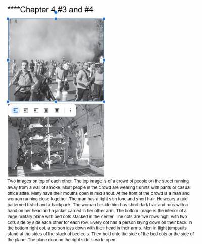
Q: Sorry about that. Here's an example of what I mean. In Chapter 4, there are two images on top of each other with one caption. The images are separate files. I wrote the alt-text treating it like a grouped image, but when it comes to inserting the alt text, I'm not sure if I should just add it to the first image, or split my alt text into two and add it to it's respective image. This is because the images are separate files instead of one file. I hope this clarifies my question.
A: As these are separate image files, you can treat them as such and enter the alt-text for each separately.
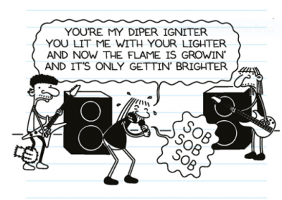
Q: Speech bubbles in Diary of a Wimpy Kid: Diper Overlode.
This book has speech bubbles with wavy outlines. In most cases, these wavy bubbles contain only sounds, but occasionally there are full sentences. (Most of the sounds effects are not in bubbles and I have been transcribing them for the full comic experience.) The internet tells me that bubbles of this shape indicate weakness, wariness, unease, or anxiety. Sources: https://e621.net/wiki_pages/44130 https://www.animaker.com/blog/speech-bubbles-meaning-in-animated-videos/
Two questions:
1. How should I describe these in alt-text? What I read in the comics/ graphic novel section is that speech bubbles are described simply by saying, “He says…” and scream bubbles are described simply by saying, “He screams/ shouts…” Can I say that a character “says warily…” or “says with unease”?
2. How should I reference these in the production note? I haven’t found a source that gives them an authoritative name like Speech Bubble or Scream Bubble.
Here's an image that uses one wavy-outlined bubble for singing and one for sound (usually singing is indicated with music notes inside the bubble, but there are some inconsistencies):
A: It would be better to use a more clear and direct word for the reading level, for example she cries: "Sob, Sob, Sob". The prod not for this book should be fairly brief, do not use the full comic prod note as this is not a comic. Include note about illustration style, and background style. The speech bubbles can be included in your note about the illustration style. For example: All the images in this book are drawn as simple line figures over a background that imitates a lined piece of paper. Many of the images include the characters speaking to each other with speech bubbles, as well as sounds represented with words. These have been transcribed directly into the Alt-text as they occur. Feel free to reword that as needed.
—-
Q: Diary of a Wimpy Kid, Diper Overlode again. There are quite a number of speech bubbles among these images! Should I be describing the speech bubbles (e.g. A speech bubble over Greg's head reads…)? Or can I just say, "Greg says:…" and maybe include something in an earlier image that all speech is inside bubbles?
Now that I type this, I think my second idea is the way to go, but asking anyway…
A: With speak bubbles follow the Comic Guidelines.
—-
Q: For black and white line drawings, like those in Diary of a Wimpy Kid where there is no shading to suggest shades of colour, is it ok to describe things as black or white, rather than dark-coloured or light-coloured? Here's another image for fun (Greg is an adult now):
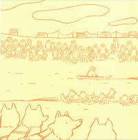
This Illustration is a continuation of the one before.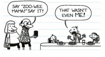 A: Put in a prod note that described the Illustration and page style (lined pages). There should be a note in the copyright about the style. You can also mention the speech bubbles in the note.
—-
Q: In Diary of a Wimpy Kid: Diper Overlode, the narrator (who is also a character in the story) never names himself but he is known from other books in the series and is named in the summary on the back of the book. The first image gives a hint of his name (that's him on the poster and kneeling in front of it), but again it's not directly stated. When I am writing alt-text, can I use his name or should I always refer to him by identifying features?
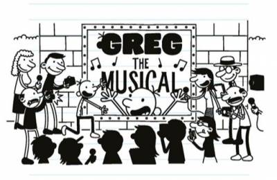 A: Describe him when you first see him. Only describe his physical appearance again if he changes. You can use his name as he is named in previous books.
—-
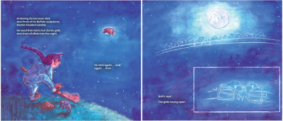
Q: A two-page spread with inset image in Buffalo Wild!
In Buffalo Wild!, there is a two-page spread with another image inset on the second page. The text on the second page goes with the inset image. In the alt-text for the second page, can I say something like: "This illustration is a continuation of the one before and there are two images, one on top of the other"? This phrasing combines the 2-page spread text with grouped image text.
 A: Try:
 Describe the bigger image. Then: There is an smaller image over top of the bottom of the page Describe smaller image. As its a kids book we have to be mindful of the reading level and try to our best not to disrupt the narrative tone of the story.
—-
Q: Rephrasing my previous question and including the image.
I'm using the quadrant method to describe this image, and one scene is in the centre and overlaps in each quadrant. I have described the upper left and upper right scenes first, as in reading order. Is it best to then go bottom left and bottom right or clockwise with bottom right then bottom left? I don't want to confuse the reader by going in an order they don't expect.
Repeated Images A: Thank you for the image! Yes, for this one you want to start with the center and the clock method for the outer images works in this case. Just make sure you are clear where you are moving next in your description. For example: The top left side, the top right side, the bottom right side, the bottom left side. Let me know if you need more assistance with this one, it is an impressive image. You got this!
—-
Q: I'm using the quadrant method of describing a complex image in Spirits of the Coast. What order is best to describe the quadrants in: clockwise or in the direction of reading in English? Some scenes in this image overlap quadrants and my description of them will depend a bit on this order.
A: It depends on the map and how the data is organized. Is it centralized and radiates outward from the central point? Then the clock method works. If not, then the quadrants and/or NWSE methods work. If there is not compass on the map (e.g. it is not clear where NWSE directions are) then us up, down and left, right. I would have to see the image to give an answer. Please always post the image along with your question.
—-
Q: Images descriptions for book: Teaching to Diversity
1) Figure 4.5 includes a figure and a table (See attached image). What is the best practice of describing such an image?
2) Figure 4.7 displays a table (See attached image). However, such table is only used to lay out the information without table headers. Should we transcribe this image as a list with nested lists and delete the image? If the image is transcribed as a list and then deleted, there will be no table or figure in the edited Word file for the Figure 4.7. How should we treat the caption “Figure 4.7 MI web of ideas for Unit 1 activities”? Thanks.
 —–
Q: In The Indians of New Jersey, each chapter begins with a small illustration that includes the first letter of the first word of that chapter. I think the letter on its own would be considered decorative in an eText, so I wonder if I should also ignore it for this human narration alt-text and assume that the human narrator will read the full word. That said, these images aren't always in the right place in the EPUB…
Here's an example of the illustration style as well the misplacement of the illustration (the illustration should be at the top of this section for the N to complete the word NOW at the top):
 A: Yes, these would be considered decorative, so we can remove them.
—-
Q: Alt-text for one-page comic inside text with no other comics. Book: Spirits of the Coast.
In Spirits of the Coast there is a one-page comic. The section is titled Orcie the Orca, which sounds appropriate to the comic, but the section contains other images as well as an introduction to all of the images as a group. Each panel in the comic is a separate image file.
I’ve written alt-text in the format for Comics and Graphic Novels, where there is an introductory description for the whole page and then individual descriptions for each image. I’m not sure how to make this fit into the otherwise-non-comic book as it is, but I’ve thought of a couple options:
1. Add the introductory alt-text to the start of the description for the first image.
2. Turn all six images into one image file and write a long description that describes all images.
Here's the comic:
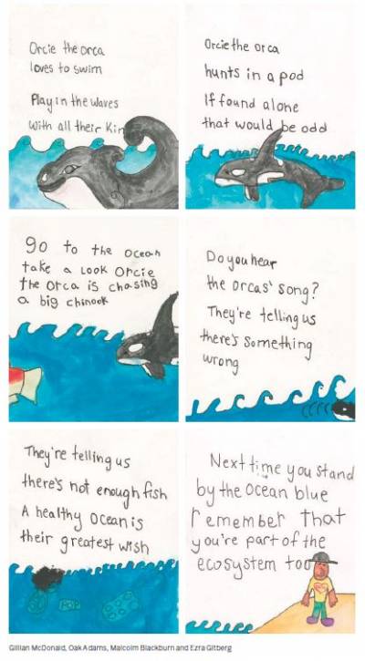 A: The image should be one image with a long description. I uploaded the single full image of the comic to Cyberduck>Preprod>Unedited titled: Orca_Comic
—-
Q: Alt-text for thumbnail images. Book: Spirits of the Coast.
In two sections of this book are thumbnail versions of images that are presented earlier in the book in larger size. I will describe the first ones thoroughly, and understand that for the thumbnails I can just reference the previous ones. But how do I do this? By page numbers make sense in theory, but many of the first, larger versions don’t have page numbers near them. By sections make sense in theory, but there are often more than one in a section. The titles of the images are in their captions, so maybe by section and title/caption? What wording would I use?
A: Title/caption works. For more on how to deal with Repeated images, go to the section
 on the Dealing with Multiple Images page of the wiki.
—-
Q: For Peyakow, I'm reinserting images from the pdf that weren't properly converted. In the middle of the book there are a few pages with just images and each have their own captions.
1. I'm wondering how I should insert the images into the edited document. Do I keep the same layout as the original? Or can I add them one after another since they each have their own captions and don't seem to grouped together meaningfully?
When I am upset, I can… 2. The pages of images are found in the middle of a chapter and interrupts the text midway. Should I add a heading to indicate this is a section with just images?
A: Simply order them one after the other down the page. No need to add a heading.
—-
Q: Keep a decorative image in because it’s referenced later? In Spirits of the Coast.
The Title Page in the PDF has illustrations behind the text. I think they are decorative, so removed them. But turns out they are vaguely referenced in the Artists’ Statements section at the end of the book. The artist who created the cover (which I will definitely keep and describe) also created the title page images. None of them are explicitly referenced in the text but there are thumbnails for both in this section. Should I keep the title page images since they are (sort of) referred to later? Should I remove both the title page images and the later thumbnail to avoid confusion?
Here are the images. Title page images in first screenshot; Artists' Statement section in second screenshot.
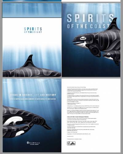
 A: In the top two images, it looks like there is a half-tile page and a title page. You only have to keep the second one. Normally, we could remove these images, but in this case as they are referenced again, you can keep them. On how to describe them, please refer to the wiki page on Multiple Images: Two Page Spreads, Images in Sequence, Repeated Images and Grouped Images
—-
Q: "Ensouling our Schools" has a table with images in it. How should I tackle this?
 A: So this is actually not a table, as it had no heading row. All Tables require a heading row. The publisher used a table for layout, so we will have to reformat this as a list.
Format
 to normal followed by a nested list that would be as follows:
* Activities
* Listen to music or ride my bike [Image with simple Alt-text. E.g. Icon of person walking forward]
—-
Q: Question about the images in the poetry: Blue Marrow
There are several images in the book (i.e., on pages of 7, 10, 17, 27, 33, 39, 45, 58, 64, 71, 86, and 97 in the PDF file). I am not quite sure if they are decorative images. It seems they are decorative images because no surrounding text talks about them. Could we replace them with context breaks?
A: In this case none of them are decorative. If you are not sure where to start with describing them, let me know.
—-
Q: Additional questions about the text messages in Ghost Lake.
Is it helpful to describe which side of the page the bubble is on or which side of the bubble its tail is on? Or does describing the differing colours make it clear enough who is speaking?
Many messages don't have punctuation, but sentences are implied by the separate lines. Should I add punctuation to avoid them being read like a run-on sentence? For example, the two sentences in this screenshot that read: "I know you're cheating on me Why are you you Doing this to me?"
A text bubble conversation. First person texts: "…". Second person replies: "…". A: Great question, and it depends on if you are doing just Alt-text or a Long Description. Remember, we want to stick to the facts and keep it direct and simple. It might be easier not to describe the shades to make it more direct. What do the shades and direction of the bubbles tell us? Answer: Who is taking when. So we can take that knowledge and create a description that is about the conversation and leave out the colours and bubble directions as it just weighs it down.
For the ones that are just one or two text bubbles, just do Alt Text. You can add punctuation to help create pauses. In the original it was line breaks that create pauses, but since we can not have line breaks in Alt-text we can use punctuation. For example:
For the ones that are three or more text bubbles, you should do a Long Description. I would also add punctuation to avoid any confusion.

You do not transcribe the text at all into the Alt-text, only into the long description section of the eText. For example:

Alt-Text:
Text message conversation. See the link below the image for an extended description.
Long Description:
A text bubble conversation. The conversation in order is as follows:
"…."
"…."
"…"
<note tip>If it is clear from the surrounding text who is talking for which text bubble, then you can use their name instead of "First Person" or "Second Person". So it would be something like: Magda says: ".." Rachel replies: "…"</note>
—-
Q: When the image in the PDF and the Word doc don't match. Book is Ghost Lake.
I have two more instances of mismatched images in this book. I'm guessing we honor the original PDF over the word doc that we are given, but I don't know how to do that when images are different or missing from the word doc.
Example 1: Each chapter in the PDF has full page images behind the text of the first page of the chapter. In the word doc, the image is different and the title is repeated beneath it. One chapter in the word doc doesn't have an image at all, only the text. Here are the images:
PDF chapter heading image:
Dark grey speech bubble with text that reads: "…." Word doc chapter heading image:
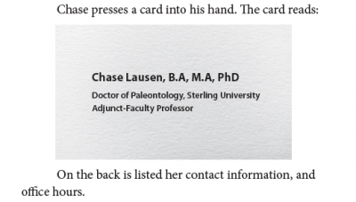
 Example 2: The text refers to a business card and then there is a picture below. In the PDF, this is appears as a grey box with text inside it. It in the word doc, the grey box is several paragraphs away from the text, which appears as body text. Here are images:
PDF:
 Word doc (after I moved the box closer to the text it goes with):
 A: Those images of the chapter headings can just be deleted. The text for the heading is directly below they, so simply style that text as the proper heading level. The way the text converted for the business card is fine as it is, just delete that black rectangle.
I also noticed while looking at this file that the images are all floating and sometimes they are in the wrong spot. When you are replacing the decorative images that are used as content breaks, make sure to double check the PDF to ensure you are putting the horizontal line in the right spot. See the video I sent via RT for further instructions.
—-
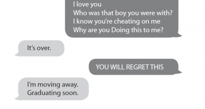
Q: Question about formatting of text message exchanges. Book is Ghost Lake.
I'm not sure if this is a Production Q or Alt-text Q! In the original PDF, there are images of bubbles representing text messages. In the word doc, these messages are individual lines of text, not images. How do I format/ style these to show they are messages and to show they are written by two different people? (I found instructions about writing alt-text for images of text, but I'm not sure if that applies since they aren't images in the word doc.)
PDF:
 Word doc (the wide grey rectangle is a page break):
 A: Update: When images do not render properly and convert wrong, you can use the screen shot method from How to Extract Images from a PDF. I already did this for you and uploaded a folder of the images to Cyberduck.
Alt-text for most of these can be something like:
 or Light grey speech bubble with text that reads: "…."
For the larger images of a text conversation you can do a long description so you can use paragraph breaks to separate the responses. For how to set up a Long Description section in a book see Complex Image Description Section
For the actual description it can be something like:
[Alt-text] Text message conversation. See the link below the image for an extended description.
[Long Desc.]Text message conversation. The text reads:
[then transcribe the conversation in order within quotation marks with paragraph breaks between each response]
—-
Q: Working on the young adult fiction book The Abyss Surrounds Us. Between the dedication and the first chapter is a map. The map is untitled but does have several locations marked that I can guess it is of the area where the novel takes place. I have written alt-text and a long description for it. To add this content to the book in the Complex Image Descriptions section, I need a title of the map. What are the conventions for creating a title for a map? Here is the map. I'm guessing I could just call it Map of the NeoPacific Area? Dear Peter,
Hello from the basement! Do you like my evil ship? Please
note its gigantic smokestack nostrils. (Minus the nose hairs.
I couldn’t figure out how to do nose hairs on a ship.) What a
noise this monster made very early on our twelfth birthday.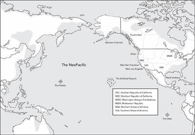 A: Simply "Description of Map" is fine.
—-
Q: I think an edit needs to be made to a link on the wiki… On the page Complex Images and Long Descriptions, under Getting Started, in the blue box that says "For information on how to format the Complex Image Book section go to Complex Image Descriptions wiki page under Book Sections on the main eText page". The link to Complex Image Descriptions links to the same page it's on, but I think it should link to Complex Image Description Section. Similar titles, different content– the former talks about how to write descriptions; the latter describes how to add the descriptions to the book.
A: This should be fixed.
—-
Q:Working on an audiobook title "The Coconut Bunny Butt Caper". It has a few instances of decorative section breaks consisting of a row of easter eggs. I know in an ebook they would be removed and replaced with a line, but as this will be an audio version I was not sure if it was necessary to give them a short description? Sorry I can't upload a screenshot because the wiki is telling me I don't have enough rights.
A: Decorative images don't need to be described.
—-
Q: If the exact same image appears again later in a text, does it need to be re-described, or should a shorter form be given that refers back to the first alt-text description? As an example, in Nishga, the same image of the author's father painting a frog appears twice, only a few pages apart.
A: Great question! I added a section to the wiki about how to deal with repeated images on the Dealing with Multiple Images page, and I uploaded an example to the Examples Multiple Images
—-
Q: "Nishga" has images that are layered on top of each other. Sometimes they are two photographs layered, and sometimes they're photographs filling traditional artistic illustrations. Their context is relatively general, as they appear between separate sections of text on their own pages. I don't think they're decorative, because some images include family members of the author. Here's some examples:
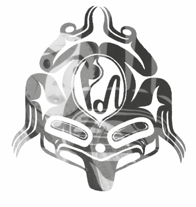

 I'm a little stumped on how to approach these, especially the overlayed photographs. For the filled traditional images, I'm thinking I should start with the shape, then move into the fillers?
A: Great question. So these can be described as collages. You can set it up with something like: "A collage of translucent images layered on top of each other." For the ones where the images are inside a shape, you are correct to go with your gut about starting with the shape. You shouldn't have to go into too much detail for each layer, a sentence or two tops. Do it layer by layer (think of the tip for describing complex images: break it down into smaller parts and describe it in order.) Stick to the facts and it is okay to be more general in your descriptions with these ones. Try not to over think these ones, as I can also help you out in editing.
—-
Q: "Dear Peter, Dear Ulla" has a couple of images that are meant to have been drawn by a child. The text explains what they're meant to be after the image, but they usually do not have any context before them. Here's an example:
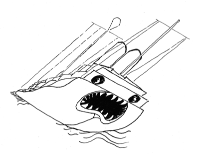 The text immediately afterwards explains that the drawing is of a German warship. To me, that isn't obvious just looking at the image. Should I break it down by part, or can I summarize it as a drawing of a ship before jumping into details?
A: When asking questions about context and surrounding text, it is helpful to include the surrounding text. The only text that is clearly about the image is as follows:
Given this context we know the following:
  * that is is a hand drawing of an evil ship included in the letter
  * The drawing is by Ulla
  * The ship as gigantic smokestack nostrils (though we don't know what this looks like)

There is not enough there to say it is described in the surround text. There is no visual information other than its a drawing that involves smokestack nostrils.

Summarizing sentence would be something like:
Ulla's line drawing of an evil ship. Then start going into details from biggest to smallest. Borrow language from the surrounding text in your description. Maybe something like: The smokestack nostrils sit on the top of the ship and include what they look like in the drawing.
Remember, we are replacing images with text.
—-
Q: On the first pages in "The Lotterys Plus One," there are two images I'm not sure they are decorative and should be removed. Please see below.
The problem with this song is that everyone thinks they already know how it’s supposed to go.

 A: The tree should stay, as the surrounding text talks about trees. The butterflies are decorative.
—-
Q: In the short story 'The Entertainer' in the book Animal People, there are 5 pieces of sheet music. Should these be described? Below is an example of the first image.
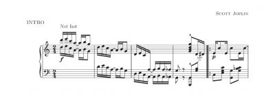 A: Great question! It all comes down to context. At first glance, this may appear decorative, but you will note the images occur only at the beginning of some sections. This is the first indicator that this is not decorative, and holds meaning to the story. Then next question is to ask: "How much meaning?" Given the context, what would the reader lose if they could not see the image. This helps use gage how much to describe.
The beginning of the story reads as follows:
I haven’t even started yet, but I can tell you what’s going to happen during the performance and how it will end. The first three bars will be no problem. It even says you should play them “not fast,” so I will roll through nice and even, right to left, down and down and down, before I drop straight into the signature theme. Then the moment of recognition will arrive, and all the people here will make the connection at the same time: Oh yeah, they’ll think, this is “The Entertainer.” And they’ll all have the same expectations for what’s coming next, especially the middle sections where you need to be so quick and clear and precise. Those are the parts they’ll be looking forward to, the famous turns and switchbacks, but, even in practice, I’ve never come through those sections clean, and unless some miracle occurs, that is not going to change today. Right now, I am the only one who understands how bad the situation is, but in about ten minutes, my disaster is going to swallow everyone in this room.
Given this context, now we know the following is important:
  * "not fast" annotation
  * intro into signature theme
  * middle sections with the famous turns and switchbacks

Another thing we can do is talk to someone who knows how to read music. Lucky for us, our Braille Coordinator, Riane, not only reads music, but describes it for Braille. Braille is a bit different than what we are doing, but we can borrow this information as we build an image description.

Fun fact, the Entertainer has been written as numerous "levels" because it continues to be the perfect music history lesson and example of ragtime/syncopation for young musicians. I would mention something about the rag time rhythm or syncopated rhythm too, if the surrounding text doesn't already say something about it. The elements of the music and the general trends are what's important. Notation can get complicated because of key signatures and accidentals.

A possible intro could be:
A piano score of the first 5 measures of the intro to Scott Joplin's "The Entertainer", which is has a rag time rhythm. The forte 16th and 8th note combinations which descend in two-four time have a "not fast" tempo.
Then go into describing how the notes read in order. Include the note name and octave. so like A2 or F#4, and then the note length. Remember when it goes into the signature theme, and where those switchbacks are. I would also look up the if anyone has describe the song, even in review or lessons, could help you find words to describe it. There are some links in a question below on how to identify parts of the music sheet, the help you identify some of those notes. I also asked Riane if she has any other resources. This is an example where we have to do a bit of research, talk to a few people with more knowledge on the subject, and then start with a really rough draft and edit it down.
Focus on getting the note names, octaves and lengths correct and in order first, then work on filling in other details (like where the switchbacks are), then edit it for clarity. Feel free to send me a draft as you work. I recommend a google doc for ease of editing and comments. Riane also offered to take a look.
You got this!
—-
Q: Just a basic question – is it too informal to refer to a picture in the alt-text as a selfie?
A: Great question! And it all comes down to context! Is it clear from the surrounding text, where the picture is (genre, audience, etc.), that it is indeed a selfie? You would still need to give more details (angle, facial expression, gender, skin tone, age, what they are wearing, etc..) So the short answer, it depends on context.
—-
Q: Myths and Legends of the World has a lot of Images Across 2 Pages. I understand how to describe these per the wiki page, however I'm wondering if there is ever a case where it makes more sense to insert a screenshot (.png) of the full-width image instead and describe it as one image. Is it a disruptive experience for so many images to be described as two when a more holistic impression could be given to the readers by only having a single image?
the letter reads as follows: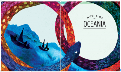
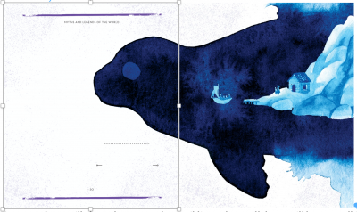 (In the examples above, the image on the left is selected to indicate there are two images here. When not selected, the image is seamless and could be used for a screenshot. However, if described as two images they will of course go on their own lines.)
A: Good question. This book has a mixture of different types of spreads that are dependent on the context. For images like your examples, the image is mainly on one page and overlaps over to the next only slightly. In these cases you can combine the image into one. On pages where the images go straight across the page with text on each page, then you treat them as physically separate and follow the guidelines for descriptions. This means we are keeping the book as close to the original as possible and are following copyright law.
—-
Q: Another questions about "Truth, Lies and Herasy". There is a bar of music that relatively well described in the surrounding text. I've never described a bar of music before… should I name the notes (i.e. the lyrics "summer" an eight note on high E descends to an eight note on high c")? Thanks for your help.
 A: The surrounding text does a good job saying what the image represents, but not what is in the image itself. Remember, image descriptions are replacing images with text, so it is describing literally what you see and objectively. This image would be something like: The music sheet for the first part of Summertime…then break down each part of the image into logical smaller parts and describe in order using the appropriate language for reading music sheets. I found a few websites that define the different parts. Here is the first link. Here is the second link. Here is a third link. These should help you with what words to use.
—-
Q: I'm working on the narration project "Truth Lies and Herasey" which includes images of several album covers. The cover for Cheap Thrills is quite complex - a comic with panels for each title on the track! My initial thought was to do a complex description, describing each panel. However, on second thought, I'm not sure that context warrants that? The books is more about producing the album, and doesn't include any information on the album art… that being said, some research on the cover suggests that it is pretty iconic so maybe a detailed description is appropriate? I would love to pick your brain on this one!
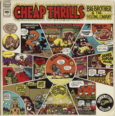 A: We try to avoid long descriptions for Audiobooks, as there is no way to make the description skippable at this time. This image is highly complex, so the long description would end up being very long. I would suggest a middle ground. Describe the cover in a broader description, while leaving out the smaller details. The context does not call for a detailed description, but I can see why you would want to dive a bit deeper. For the description, try to keep it 6-8 sentences long. Remember to start big and then drill down into smaller details. It would be more of an overview description than a full detailed description. Does that make sense?
—-
Q: I'm working on the narration project for "A wholesome horror" and the document includes an image of the back cover which has an image and two quotes. I just wanted to double check that I should describe the image and transcribe the quotes? I know that in our normal workflow I wouldn't describe a back cover, but I would transcribe the text, so I would do double check how that might be similar/different for narration projects. Thanks!
 A: Good Question. Please describe the image and transcribe the text.
—-
Q: The document for Invisible Ink—a Human Narration project—has all the image files in the reverse order from how they appear in the book. Should I put the images in order? (Is this technically an alt-text question or should I move it to general Q&A?)
A: Oh no! That is my bad and I apologize. Yes, reorder the images so the narrator can read them in the right order. I will be more careful moving forward.
—-
Q: Struggling with this one too (Truth Lies and Hearsy). I can't figure out how to write that some things are in rectangles. Like the title is in a purple rectangle at the top. But that's super awkward. There are a lot of covers in this book and they're all rectangles with words over them.
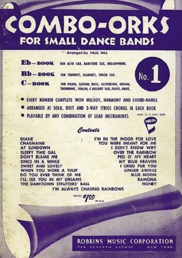 Here's what I have so far:
Book cover titled: ‘Combo-Orks for Small Dance Bands No. 1’ by Robbins Music Corporation. The title is at the top written in block white letters over a purple rectangle. A paper with the bottom rolled up drops from the rectangle. A purple shadow is under the roll in the bottom right corner. On the paper, the text reads: ‘Eb – Book or Alto Sax, Baritone Sax, mellophone. BB – Book for Trumpet, Clarinet, Tenor Sax. C – Book For Piano, Guitar, Bass, Accordion, Organ, Trombone, Violin, C Melody Sax, Flute, Oboe. Every number complete with melody, harmony, and chord-names. Arranged as solo, duet, and 3-way (trio) chorus in each book. Playable by any combination of lead instruments. Contents: Diane, Charmaine, At Sundown, Sleepy Time Gal, Don’t Blame Me, Once in a While, Sweet and Lovely, When You Wore a Tulip, Do You Ever Think of Me, I’ll See You In My Dreams, The Darktown Strutters’ Ball, I’m Always Chasing Rainbows, I’m in the Mood for Love, You Were Meant for Me, I Don’t Know Why, Over the Rainbow, Peg O’ My Heart, MY Blue Heaven, I Cried for You, Linger Awhile, Blue Moon, Ramona, Honey’.
The transcription is the long part.
I'm really not in love at all with how I wrote this alt text but I also can't figure out how to describe the rolled up paper… I thought maybe scroll-like but it isn't a scroll. I don't know. Any advice on how to fix it up? Working on making it technical but so far it seems more narrative.
A: That description is fine! Maybe tweak the beginning to say "The title is along the top in white text over a purple rectangle …." You don't have to transcribe everything on the cover given the context. This one is a bit of a judgement call.
—-
Q: I'm really struggling with how to write alt text for this. I've left it and come back to it several times (from Truth Lies and Heasy).
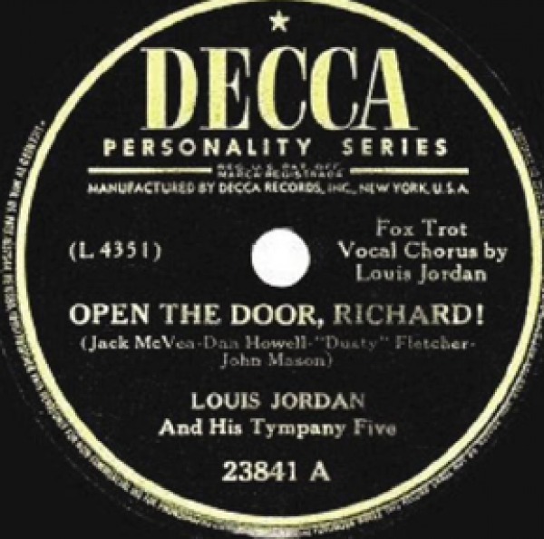 So far I have: A record from the Decca Personality Series for the song ‘Open the Door, Richard!’ by Louis Jordan. A yellow circle over a black background.
I was thinking to add "text inside the circle reads:" and then list out what it says. But then it's redundant with my summarizing sentence.
I'm not even sure if I'm using the correct terminology. Help please and thank you!
A: That would not be redundant, it is being concise. Just needs a bit of tweaking. Maybe: "The centre label of a record from the Decca Personality Series for the song ‘Open the Door, Richard!’ by Louis Jordan. The label is a yellow circle over a black background. Text inside the circle reads: …."
—-
Q: General question, but especially relevant to biography/autobiography: When describing identified people, should we refer to them by first or last name in the alt-text (if both names are known)?
A: Good question! This will be dependant on context. Does the book talk about the person using their first name only? Last name only? Is it a book about athletes? Athletes are often talked about with last name only. Is it a celebrity who is always named with their full name? Then use their full name. Is a name in the caption? The most important thing is to make sure that it is clear in the description who you are referring to. There are no hard and fast rules on this other than matching the context, being clear, and never name a character/person before they are named in a book.
—-
Q: Just started on Invisible Ink, which is a Human Narration project. There are a couple letters that will need to be transcribed. Do I just transcribe them word for word (the epub original text has introductory remarks on both)? Are we able to use quotation marks (which are not allowed in traditional alt-text entries because of how they affect final coding)? Is it okay to use paragraph breaks?
A: What is the context? Same rules apply in description. Is it important for the reader to have access to all the text in the image? If so then fully transcribe following the rules of Images of Text. For example: the first letter the author states the important of the letter then states they are sharing it with the reader and ends that sentence with a colon, but none of the letter is transcribed in the surrounding text. These are all indicators that in this context the letter needs to be fully transcribed as it is important to the context of the book and without it the reader will be losing important information. You don't have to use quotation marks unless you think it will help the narrator or is part of the original (remember a person is reading this into a recording for an audiobook version of this book.) To continue with the example above, you can start the description with a phrase like
 then transcribe from the date at the top down the page in order, making note that there is also a hand written signature. In this context, as the letter is personally addressed and of great significance to the author then that hand written signature is important to include in the description. You can definitely use paragraph breaks to help divide information and make it easier to read. This is not going into Alt-text, it will be read into a recording in reading order.
—-
Q: Working on Only Make Believe and I have come across a small snag:
There is a chapter FULL of images. Super cool. BUT. Some of them look like this and they did not separate during conversion:
Images with Text'' category. It is all about context. In this case, there would be no reason to transcribe the entire image, because it is explained in the surrounding text what it is. Also, it is illegible, so you no one would be able to transcribe it. You just state what it is (advert) and then transcribe the headline. See Images with Text
 My solution looks a little sloppy but… works(ish?). Thoughts on how to better do this?
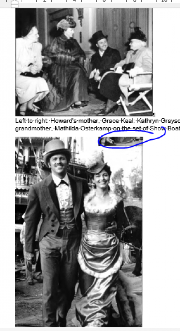 A: This is the best you will get it, unless you screenshot it as one large photo and describe as two images in one description. It is a scan from print, so we are limited on what we can do with the images.
—-
Q: I'm finished Copeaux. Before I submit, I'm not sure what the rules are now that we keep cover images. What happens when the cover has no image? We just skip it right? I wanted to make sure before I did so.
Example:
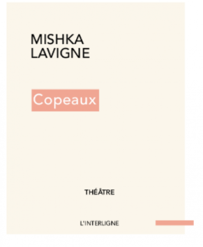 A: Just use a simple description. What visually stands out? For example something like: Title: '' by _. Cover is beige with title written in a light red box in white font. The rest of the text is in black.
—–
Q: There are also some racist and stereotypical images in this book that may be triggering (example: cartoon of John A. MacDonald standing over an Indigenous family, waving his baton at them and forcing them into the Pacific Ocean. In this image the Indigenous adults have traditional headdresses and cloaks on and were given no face. Additionally, their faces were colored in in a racist way). Should I put some trigger warnings?
Also, I don't quite know how to describe the way their faces were coloured in without being offensive or triggering. Could I get some ideas to bounce off of?
Here is the image:
 What I have so far:
A black and white cartoon shows John A. MacDonald, who stands near the edge of land, leading an army of white men in business suits. He stands tall over an Indigenous family, and points his baton at them. Two adults stand cowering, with a small child behind them, who holds a baby. They wear feather headdresses, and traditional cloaks. They are being pushed out into a body of water that has the words “Pacific Ocean” written across it. A large sun with bright streaks coming from it reads “Westwards Ho” in the horizon. Behind the army of men is a train engine with a cloud of smoke coming from it that reads “civilization”. The Indigenous family are portrayed without faces, and (how do I write that their skin tone is depicted In a racist way without imposing/interpreting that onto the image?)
I have been really struggling with this one. Thanks for the help!
A: So this is a great example of context! This is a history book that is about a very dark time in Canada's history, and it is sharing some disturbing facts. When you read the book you know you are reading a history book about the Métis Rebellion. Remember context is key! The caption for this photo reads:
""WHAT IT MUST COME TO. (With the encroachment of civilization.) Officer—'Here, you copper colored gentlemen, no loafing allowed, you must either work or jump.' " This cartoon was published shortly after the rebellion but it is a particularly apt, and blunt, portrayal of the feelings of Eastern Canada towards the Indians of the North-West. Sir John A. Macdonald leading a horde of workingmen, backed by the railway (smoke from a train engine spells "civilization" in the cartoon), pushing the Indians into the ocean was a popular image. [The Toronto News, June 20, 1885]"
I now know more about the context of this book. First, it is a history book about the Métis Rebellion and aims to give a fuller context from the Métis perspective. This includes the way Colonialists treated them at this time. Second, I know this is cartoon that is used in this book to showcase the racism and hatred towards the Métis and other Indigenous people at that time as explained in the caption. The writer's intent with this cartoon is to show how ugly MacDonald and the colonialists were to Indigenous people at this time.
I also know that to give a good image description I can not censor, and I have to remain objective so the reader can come to their own conclusions. The below revisions allow for the reader to have the same reaction you had to the image while remaining objective.
"A black and white cartoon shows John A. MacDonald leading an army of white men in business suits towards a small family of Indigenous people who huddle at the edge of a cliff on a shoreline of a large body of water. Text over the water reads: "Pacific Ocean”. A large sun is on the horizon of the water with text that reads: “Westwards Ho”. MacDonald is drawn larger than the other people in the photo and holds up a baton towards the Indigenous family. The family is made up of two adults and a small child who stands behind them holding onto a baby. They are drawn with their faces fully shaded in with no facial features. They wear feather headdresses and traditional cloaks."
—-
Q: I'm working on Sapiens and there are some borderless maps that are giving me some trouble. The maps are referring to very early time periods, but for clarity I feel like I need to refer to them in modern day terms (i.e. modern day Spain). Additionally, in some cases I can refer to an entire continent or a large region, but in other cases the maps are more specific and I feel like I need to refer to specific countries. I've attached one example of such a map and a draft of my description that I'm hoping I can get your feedback on. To me, it feels clunky.
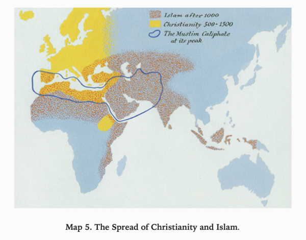 Long Description:
A map of the Eastern Hemisphere depicting the spread of Christianity and Islam. A legend describes two types of shading indicating “Islam after 1000” and “Christianity 500-1500” as well as a line indicating “The Muslim Caliphate at its peak”.
The “Islam after 1000” area covers modern day Spain, Northern and Eastern Africa, and parts of Asia including Central Asia, South Asia, Malaysia, and Indonesia.
The “Christianity 500-1500” area covers Europe, Northern Africa, the southwest corner of Asia (including Egypt, Lebanon, Syria, and Turkey), and parts of modern-day Sudan, Eritrea, and Ethiopia.
The line labeled “The Muslim Caliphate at its peak” encompasses Northern Africa, and Southwestern Asia.
A: This is a good description, just remember if something can be a list then it should be! Also, avoid using 'as well as' whenever possible. The usage of as can cause confusion for people with cognitive disabilities. It is also more passive. Use 'and' or start a new sentence. Remember to be Active Voice, Present Tense. This map has colour and texture, so I would include that as well! You also need to work more on creating balance in your sentence structure and grammar for long descriptions. This will help with clarity, and can also make it easier to describe the image. See revisions below:
A map of the Eastern Hemisphere depicts the spread of Christianity and Islam. The legend indicates areas shaded with red dots for “Islam after 1000” and areas shaded in solid yellow for “Christianity 500-1500”. A blue line indicate the border area of “The Muslim Caliphate at its peak”. There are no borders or labels on the map.
The “Islam after 1000” area covers:
* modern day Spain
* Northern and Eastern Africa
* Northwestern parts of Asia including:
* Central Asia
* South Asia
* Malaysia
* and Indonesia.
The “Christianity 500-1500” area covers:
* modern day Europe
* Northern Africa
* Southwestern corner of Asia including:
* Egypt
* Lebanon
* Syria
* and Turkey
* Modern-day Sudan (be more specific that 'parts' what parts? Remember spacial awareness is important. You can tell me what a place is, but for a map I need to know where it is.)
* Eritrea
* and Ethiopia.
The blue line labeled “The Muslim Caliphate at its peak” encompasses:
* Northern Africa
* and Southwestern Asia.
—-
Q: I am working on Prairie Fire and saw this image that I have to write alt-text for. I'm unsure of how to write alt-text for this… I can't read most of the words. Is this considered complex alt-text? I don't even know where to start…
 A: So this falls under the
Q: I'm working on the comic pages for Mermaids in "Angel Wing Splash Pattern". The comic is based on the short story in the book, and I'm wondering if I can base some of my description on the text in the short storey. For example, panel 3 on page 1 shows something dripping down the figures leg (in black and white). If I had the comic alone I would not infer what it was that was dripping… but from the short story I know that it is blood that it is dripping. It is appropriate to describe this as blood? Or do I need to let the comic speak for itself?
A: Describe it as you see it in the image only. If it is clear in the image or surrounding images that it is blood, then describe it as such.
Q: I'm currently working on "Angel Wing Splash Pattern" by Richard Van Camp and there is a white smiley face emoticon on the bottom of the first page of the introduction. However, when I insert the unicode symbol on my mac it changes the emoticon to a yellow smiley face with blushing cheeks. Will this cause any problems with the conversion process or will I need to insert the emoticon through a different process?
A: You did it correctly. The smiley face in the original is stylized, the unicode version is accessible to screen readers. It is okay if it looks differently, it is still an emoji and is accessible.
Q: I'm working on Kamik Takes the Lead and near the end, I'm not sure if the last three images are part of the story or decorative? The story just sort of… doesn't end? And throughout the book, there are many images where there is no text. These images are a little different, which would make me assume they are decorative, but I also think that they provide some sort of context to the end of the book. Should I write alt-text for these images?
A: Good Question! So all those yellow pages can be removed, they are just decorative. I would still describe the other two images at the end. They only need simple Alt-text.
Q&A Archive
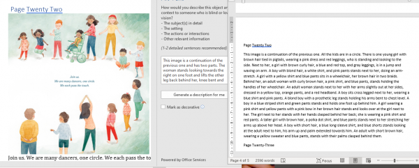
Q: I am currently working on I Will Dance and I swear I have tried to edit this image a few times but I can't figure out how to condense this into something with less words? It's such a busy image but I don't want to just say "Kids and adults stand in a circle". How do I make this less wordy? Do I remove the detail of clothing?
A: I can not read that screenshot, please email me the alt-text in a doc file so I can properly read it and provide feedback.
UPDATE: I looked at your description and the book, and one thing I noticed is that it is the same characters over and over again. When there are repeated characters you only have describe them the first time you see them, and then you just have to describe what is different (or if nothing is different, just mention them by name.) If the characters are never named then refer to them by a feature that stands out and is consistent (the girl in a wheelchair, the boy in the green hat, the girl with the pigtails.) Remember to always start big and go small. The first sentence describes the entire image. Example: "The kids form a circle and look around at each other." This first sentence sums up the entire image, but can also ground and guide your description. Then break this image down into sections and describe in order of how they are standing the ones that stick out the most. For example, the boy with the prosthetic leg, the kid sitting, the girl in the wheelchair and her caregiver, and the girl jumping. Don't worry about describing every detail. You want to walk the reader through the image in a logical order that is not overwhelming. If you are overwhelmed by what you wrote, that is a good indicator you need to describe less and be more direct and concise with your word choices. You got this!
Q: I have a couple of questions regarding "The Beach Is Loud" and children's books in general. How should one go about describing alt-text for pages with multiple, distinct images like in the image below. Should we still start the description with something similar to "This page is split into three images. In the image on top, the boy…" or would it be better to narrate progression because it's a children's book, ie. describe the first portion and then include something like "the boy is now standing in front of a table"? Also because the portions of text specific to each part of the image, I believe it needs to be included in the alt-text but should it also be transcribed into the body of book?
A: To describe the image, set it up to explain it is an image in 3 parts as in your first example. Remember when you are describing images for Children's books to be more narrative, and match the tone and rhythm of the book. Keep your word choices at the same reading level of the book. See the Alt-text section for Children's Books for more info on how to describe images in Children's books.
Images in Children's books are not treated as images of text. You transcribe the text below the image. The only time you would include text in the image description is if it is part of the image, such as sounds. For example, the pages that talk about the beach being loud. "pat pat" "stomp" etc. will be part of the image description and not transcribed.
Q: I'm working on the picture book "Do Not Eat The Game" (which is a super cute book!). Because the book talks about games, the illustrator put the images in a game board track, so there are often multiple image panels on a page, sort of like a comic book! There are two spreads in the book where there is a long panel that crosses two pages, plus smaller panels on the bottom that shows a sequence of events. I have an idea of how to tackle an image that extends over two pages, but I'm struggling with these spreads because my continuous description is interrupted by the sequence panels… can I describe the top panel fully in my first description, and then carry on with the sequence? Or do you have another idea of how I should tackle these?
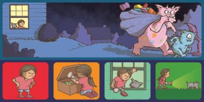
A: You could tackle this like a comic, but a little differently. Instead of panels, I would call them squares, to imitate game lingo. I would tackle this like a comic, but slightly differently. We should set up a meeting to discuss this.
Q: Another question for the I Will Dance book. After the story is over, there is the Message from the Author, a part of the book about Young Dance, a random image (pictured below) and then the Back Cover page. What do I do with this random image? It's not part of the story, it's not part of the back cover, I have no idea what to put as the header or if I should keep it?
A: Image is decorative, so it can be removed. Remember that all decorative images can be removed.
Q: I am currently working on "This Beach is Loud!" and it seems that the only that was extracted during the conversion process was the cover page. I have followed the wiki steps for extracting images using both ecancrusher and the mac terminal, but all the pages were extracted as full two-page spreads. I have also noticed that the words on the pages were extracted as separate images from the main image. Should I still use the two-page spreads for the images or can you please advise on how to properly separate the pages within the image? Also, can the images still be used if the words have been extracted from the image? Here is an example of the extracted image
Edit: There seems to be a problem with the sound for these links. There is a lot of static and the narration cannot be heard. Can you please re-record the videos. Thank you. Answer: Ironically there is a loud audio corruption on a book call The Beach is Loud! I updated the links below. Please let me know if you need anything else!
A:You don't have to worry about the words, they converted to the Word doc. When you clear formatting you can modify the Normal style as demonstration in this video:http://somup.com/criIbsY2ql Fixed layout often convert into two page layouts, and that is fine. You will need to crop the images. See this demonstration in this video:http://somup.com/criIqMY2tN Here is the link a tool to help you crop the images: https://pixlr.com/editor/
Q:I'm having some trouble with a complex image in Satan is a socialist (in chapter 6). Specifically I'm getting stuck on how/where to describe the arrows because I can't figure out if they're trying to juxtapose two events or if they have another purpose, and I'm not gleaning much from the image's context. How would you approach the arrows in this image? In my description so far, I've explained the basic layout of the chart including that it is split into two halves (pro/anti America) and then I've listed the centuries, lightside/darkside, and the events in a nested list. For example:
• 1600 o Pro-America 1620 Plymouth Colony o Anti-America 1607 Jamestown Settlement
As I've considered the arrows I wondered if I should describe them and their locations after the list, or if I should somehow integrate them into the list of events that I already have. Thanks for all your help with this title.
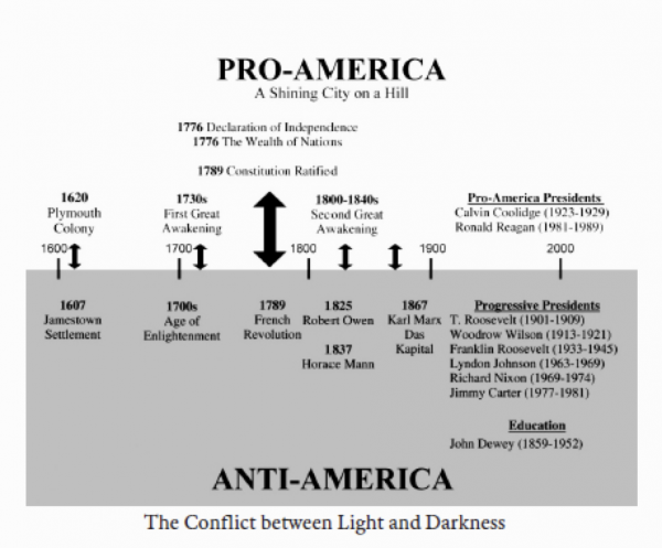
A: Looks like this is a comparative chart contrasting the pro/anti Americas. This can be a table with the heading being the Era, Pro America, Anti America. The first column would have the era (1600s) followed by the Pro/Anti info. If there is more than one comparison in an era just have multiple rows for that era.
Q:For this image in Satan is a Socialist (chapter 8), there is a footnote in the image, specifically the subtitle. Is it appropriate for me to attach the footnote to the image as a whole?
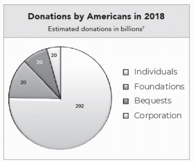
A: Add the title as a caption to the image and add the footnote to the caption. This way you are able to add the footnote to the correct phrase and it will be more clear to the reader.
Q: One more for "Peanut Goes for the Gold". I know we are not supposed to describe the text in the cover image because it will be in the metadata. However, the author kind of pops up here between the text… How do I go about describing he author without a) having it be jarring for the reader, and b) how do I indicate where the author is without describing the text?
A: It is not always necessary to include the title, author, editor or illustrator when describing a cover, but you can if you choose. In this case you are describing the font, so it is helpful to state the title again. Always break down an image and describe it in a logical sequence. I am presuming you are talking about the illustrator's name? You can break down the image description as follows:
- Title, author, illustrator. e.g. "Peanut Goes for the Gold" by Jonathan Van News, pictures by ….
- Describe font. e.g. Title is in large yellow font across the space of the cover with the words 'Peanut' and 'Gold' larger than the other words.
- Describe Hamster. e.g. Hamster jumps through title … go into details of Hamster
EDIT Q2: I was talking more about the photo of the Author (Jonathan Van News) at the top. He's holding his hand to his face? I wasn't going to describe the actual text, but I'm wondering if I have to if the author's photo is in the middle of his name up at the top? How do I do that without having it be jarring? Do I then have to talk about the text, in this case?
A: Author image is decorative. Do not include in description.
Q: Another question for "Peanut Goes for the Gold". At the very end, there is a back cover image of the author, surrounded by the characters from the book. He has a really fun mustache. I read that for About the Author, usually we remove the image of the author unless it's interesting and something that would be talked about. We want our readers to have the same experience. However, this isn't a section for "About the Author", because there is no text to accompany this back cover. So I was thinking to remove it? I'm not sure what the correct course of action is here. The back cover has no other extra interesting information about the book to offer.
A: This is a children's book, so you would follow the guidelines for Children's Books. Here are the directions for Back Covers in Children's Books.
Q: I am working on "Peanut Goes for the Gold", and I noticed that the Publishing Information is an image instead of written out. This is the first time I've come across it. I checked the Q&A and couldn't find anything about this either. Should I delete the image and re-type it, or follow the guidelines for "Images with text"?
A: This can happen if the original was a Fixed Layout ebook. Follow images of text guidelines and transcribe the section.
Q: I am currently working on writing long descriptions for some letters in "Until We Are Free." In the new video on how to insert bookmarks and return links, it states that the bookmark should be inserted at the start of the text following the image. The section I am working on though does not have any body text in between the images, . I am wondering if I should I place the return bookmark at the end of the sentence "Follow this link for an extended description at the end of the book" so the reader can progress directly to the next image or if it would be better to place the bookmark inside the described image to help the reader place themselves in the text?
A: Bookmarks for Return links are inserted at the image always. The documentation gives the following instructions: For the Return Link Bookmark:
- Locate the image for your complex description
- Highlight the image
- Go to the Insert Menu
- Locate the Links Section
- Select Bookmark
- A popup window will appear
- In the Bookmark name field enter an identifying name for the image, so you know what image goes with what description.
- NOTE: It must have no spaces
- Example: ReturntoMapManitobaVehicles
- Select Add
- You now have a bookmark for your return link!
The tutorial is out of date, and I will updated it accordingly so it shows you that the bookmark goes to the image, not the text.
Q: I am currently working on "L’accoucheuse de Scots Bay" and I am transcribing a news article that has been split into two images. I am wondering if I should transcribe the whole article (both images) into one complex image description and use the alt-text of the second image to refer the user to the complex image description of the first image. Or, should a complex image description be created for each image?
* Edit Here are the two images

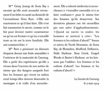
A: Thank you for the edit with the images! I think you are right in your first thought: transcribe it into one long description with a note in the Alt-text for the second image that the transcription is in the previous long description. This also matches the workflow for how to describe images that go over two pages. Let me know if you need any more clarification or guidance on this one.
Q: I'm working on Kamloopa and there are a couple of images for which alt-text has already been completed (by the publisher I'm assuming?). Can I alter their alt text to better fit our standards, or should I leave as is? I wasn't sure if this would be considered "editing" as opposed to reformatting since they've provided the alt-text.
A: Many of these images are images of text in Fixed Layout format (i.e. the entire page is rendered as a single image.) These are inaccessible, and require you to transcribe them with accessible formatting as per our documentation. If there are any images within these pages you need separated, let me know and I will get them for you.The other Alt-text is fine as it is from the publisher.
Q: I am currently working on "L'accoucheuse de Scots Bay" and there are a couple of images that seem to be news articles, see start of chapter 10, what is the best practice for handling pictures that only contain text? Is it more important to keep the image and provide the transcription in a complex image description or to transcribe the image directly into the body of the work?
A: Great question.
Context is always key when you are working with images, as the context will help you judge how much to describe, and what to describe. If the content of these newspaper clippings (articles ads etc.) are essential to the story, then they will need to be transcribed in a complex image description. Only if the it is an image of a word or phase do we transcribe and remove the image, images of newspaper clippings and ads are treated as images with text. Remember, if it is an ad then you need to also describe any images in the adds. You can use the complex description workflow. As stated on the Complex Image Description wiki page: "We can also create longer, complex descriptions when we need to transcribe an image, such as an image of a letter." Since these are french titles, please do not describe them in using DeepL, describe them in English and we will have our in house translator change them to French. If you are comfortable with transcribing the French, you may, but be very careful.
Q: I'm having some trouble with this image in the prologue of "Dream First Details later. I was doing some searching on alt-text for flow charts and this link (https://accessibility.psu.edu/images/flowcharts/) had a suggested method which is based on a nested list (although my image has 7 layers compared to the three layers in the example, so I'm not sure if my list would get to dense this way?). How should I proceed?
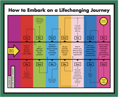
A: A nested list is the correct way to logically describe this image, some flowcharts are more complex than others so it is okay if you it has more than 3 levels. Judging from this image it looks like the longest Yes Train is 5 levels, and then is gets shorter after that. Start with the first question, follow the 5 yes's, then follow the one no in a nested list, then go to the next question and repeat.
e.g. Title: "How to Embark …"
A guide by….
Yellow Arrow Label Reads: "Start Here" at the first question. Each Question can lead to different outcomes as described below:
First question: "?"
- If "yes" then Q:
- If "yes then Q:
- If "yes then Q:
- If "yes then Q:
- If "yes then Q:
- If "no" then:
Second Question: "?"
Q: I'm not sure how to write Alt Text for this. This example happens twice within the book. The top part "BEFORE" goes along with the text "I packed a bunch of photos in my dad’s suitcase, so he wouldn’t forget us by the weekend" and so on and so forth.
A: This one is very tricky. I looked throughout the text and this seems to be a pattern. Could you pass me back this title and I will share it with our testers to see what we could potentially do to make these images. Sometimes FXL layout is not convertible to reflowable text, I will keep you posted on this.
Q: I have a question about how to approach the alt-text for images of math equations (regarding the title Fight Like a Physicist). Is there a tool/method for transcribing the equations for the alt-text? Some of the equations are relatively short, whereas others are more complex. Contextually, the equation images are part of the text, not independently described.Thank you for your help!
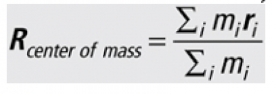

A: Good question. Use Insert / Equation and use Word’s Equation editor to build an expression, which will be stored in the document as OOML. To learn more about inserting equations check out the DAISY Advanced Guide and refer to the section on Math Equations.
Q: I have a question about the tables in Gifted Education. In Chapter 1, there are two tables, labeled Figure 1 and Figure 2. The first table is quite complex with sub-sections and annotations so I thought it would be best do leave it as an image and do a complex image description. Do you think that's best? For the second table, Figure 2, it's not as complex but still more complex that a basic table. For this one, I'm unsure whether I should also do a complex image description or if I should delete the image and reproduce it broken up into several smaller tables?
A: Good questions. In cases like this it is important to ask what these are for. It seems like these are examples of forms, and not tabular data that needs to be read in detail by the reader. In this case I would suggest doing a complex description for the forms, and remember to call them forms and not tables. The tables in these forms are there as layout design and not as tabular data.
Q: I have a question about The Pencil, an illustrated children's book. The images in the .doc file are a mixture of double wide (one single image for the left and right page) and just one page wide. Should the double wide images be split in two so we have one image per page like usual? Or should I make them small enough that they fit on a regular portrait-oriented letter-sized page? If they should be split in two, would I use the snipping tool to do that?
A: For any images that ever need edits of this nature, please send the Production Coordinator a message in the RT of the ticket to get the images for you. In this a case it should be okay. If we hit any issues during conversion I will let you know
Q: The book I am working on now, Elric: The Fortress of the Pearl by Michael Moorcock, has a map which has been split across two pages. However, in the PDF version, the map is incomplete; it appears in the scanning process, or however this book was digitized, it cut off what would be the middle of the map. How should I approach writing a description for the map?
A: We will have to make due with what we have, as there are no digital versions of this title. Just describe what you can.
Q: I have a question about how to handle an image in the book Leaving a Legacy. There is a rating scale from 1 to 5 in the text that is presented as an image. I'm considering a few different ways to handle this but I thought the following would be the simplest. Is this okay? (Or should I delete the image, insert the same image as a .jpg, and then enter alt-text for the image?) (Or, if I go with the option below, do I need to make my text replacement a Prod Note since it's my words and not the author'?)
A: This is answered on the Alt-Text page here.
Q: Hi, I'm working on A Year on the Wild Side and its complex image descriptions. I have finished moving all of the image descriptions to the end under the heading "Complex Image Descriptions" and inserted the lines "Navigate back to image" and "Follow this link for an extended description at the end of the book". Now, I'm trying to insert bookmarks and links. However, when I highlight the line, "Follow this link for an extended description at the end of the book" and right click on it, I seem to get a different menu than you. Here's a screenshot of what I see:
I've searched the top menus for a way to "Insert Highlight" and can't find one. The only highlight tools are colour changing highlights.
A: So you are not inserting a highlight, you are inserting a hyperlink. I fixed the Documentation to state Hyperlink, sorry about that confusion. In the screenshot you shared you will want to choose the 'Link' option and insert an hyperlink within the document to the sub-heading for the description you are linking to. You should have all your sub-headings in place in the Complex Image Descriptions section all set to Heading Level 2.
Q: I'm trying to add alt-text to the tables in His Needs, Her Needs but the area where I type the alt-text is greyed out:
I'm using the newest version of Word and I tried closing it and reopening it but it's still greyed out. Any suggestions?
A: Try saving the document as .docx and it should work. If you have done this and still have problems please let me know.
Q: What about emoticons? The book I'm working on quotes an email that uses ; - ) to represent a winky face emoticon. Should I leave it as is? I'm tempted to replace it with [winky face] so that it makes more sense when read by a screen reader.
A: Great question. You should replace it with a proper emoticon symbol, since we don't want to change the original too much and people who have partial sight do read our books. TTS can read emoticons, and you should treat them like other symbols and enter them in using Unicode. The directions on how to set up Unicode are on the Symbols & Abbreviations/Acronyms page (I put in a new heading 'Using Unicode for Symbols'.) You can use the search feature on the page that lists all the Unicode. For example, I searched winky face and it gave me the Unicode here.
Q: Hello! I have a question about an image in the book I'm working on, "Seeking Allah, Finding Jesus". In the Prologue, every time the author writes "Muhammad", he inserts a small image. The footnote explains that the image is a symbol representing an Arabic phrase: "peace and blessings of Allah be upon him". I'm thinking of handling this by deleting the image of the symbol and replacing it with the phrase in brackets. What do you think? If I do that, should I insert a prod note explaining what I did?
A: In this case you would treat it as a regular image and insert the Alt-text: symbol representing an Arabic phrase: "peace and blessings of Allah be upon him". You would then put a Producers Note at the beginning of the book to explain why you did this. For more info see here.
Q: I'm trying to keep in mind the aim for clarity and focus on relevant information, but I'm struggling with this. One of the first maps in this book is a map of the North-West area of Canada with a lot of lakes, rivers, and important villages labeled. Throughout the book, there are a few other maps which "zoom in" on specific areas which have already been described in this larger map, perhaps with some added details. Do I need to re-describe the area exactly? Or how should I proceed with these cases? For example, I've included the large map of The North-West and a map of Red River. Lots of the info in the Red River map are already present/described in the North-West map.
A: Maps are challenging for anyone. If you haven't already checked it out, you should go look at the Alt-text samples we have on the wiki (there are two map examples that could help.) To answer your questions: I would not repeat what has already been described. You can start the zoomed in descriptions with something along the lines of 'This map is a closer image of the Red River area…' you could include some sweeping description like "it includes the areas between these rivers" or "it is bordered by these rivers" etc. Then you can add more detail into. Remember that starting big and going small can help in these cases. I also recommend opening a new document to work on the descriptions, so you can easily edit and rewrite as you go. It is good to remember what the purpose of the map is, and to base your description on that purpose. In this case it looks like the map is meant to show the layout of the land, so you should describe it in a way the listener can get a sense of the layout. Where are the rivers and important points? Where to do they lead to. You can start big (this is a map of this area that features rivers and this lake) then start at one point and work your way through the map like you are traveling through it. Reading it aloud will also help.
Q: One more question from His Needs, Her Needs. At the very end of the book, there are 5 full-page images that are advertisements for other books by the author, for his website, and for his publisher. They aren't decorative but I'm not sure how important it is to keep them (and therefore add Alt-text to describe their content). Would you recommend deleting them or keeping them?
A: You can delete these images.
Q: In Appendix B of His Needs, Her Needs, there is a 10 page questionnaire but each page is an image file that contains text, not actually text. Am I right that I should transcribe the text from each image and then delete the image files?
A: In this instance the context is critical to understanding the book, and should be transcribed, the images should be removed, and a Producer's Note should be places at the beginning of the book explaining this has been done. I took a peek at some other parts of the book, and there seems to be other surveys as well. When it comes to these sorts of images it depends again on context, and is a judgement call. If the details of the survey is critical to the understanding of the book, then we do the transcription and Prod Not as mentioned above; if the survey is not critical to the understanding the book then simple Alt-text is enough (remember to keep the Alt-text brief and concise, and you can refer to our Alt text examples for some inspiration if you need it.) There is a Question and Answer a bit further down on this page that addresses this as well for your reference. You can also see the section on Image and Surveys for more information.
Q: What do I do when a single caption refers to and describes two different images? Is it okay to give both images the same caption? ie. copy and paste the caption and apply it once to the first image and then again to the second image?
A: You only have to apply the caption to one of the photos. With the Alt-text and the placing of the images the reader will be able to figure out what is going on.
Q: I have an image of a survey. How should I re format this?

A: It depends on the context of the image. If it’s critical to understanding the book that readers know exactly what was asked in the survey then we might want to translate the entire survey content in a prodnote; otherwise, if it doesn’t really matter to the reading experience what the details of the survey are then Alt-text will do. It’s a bit of a judgement call.
Q: If there is a photograph of a letter, should we transcribe it into the Alt-text?
A: It depends on two factors that should be taken into consideration when writing alternative text (requires some judgement):
- the context and purpose of the image: why is the image there? does the author want us to read the contents of the letter? how important is it to be able to read the letter? is there a caption? (if so, does the caption adequately describe the photograph?) You can learn more about when/how to describe here: Determining if the image needs an image description
- how long the text is: Alt text is meant to be a brief description of the image, ideally no more than 120 words as a general rule of thumb. If it's necessary to transcribe the letter and the letter is lengthy, we can create a complex description.
Q: For images that contain a lot of information (such as an Army record that contains a lot of text, finger prints, tables, etc.), what is recommended in terms of Alt Text?
A: Very good question! Image descriptions can be tricky. The first question I like to consider is the purpose of the image: is it decorative? for visual interest only? provide essential information? We also consider if it's adequately described in the surrounding content already.
Let's take "Shaw's US Army Record" image from Rich man, poor man as an example (below). There's a lot of text embedded within this image.
What's the purpose? This image is located at the end of the book (in the biography section) and a brief caption is provided. I haven't read the book, but I think the general purpose of the image is to give the reader a sense of what his Army record looked like, so the alternative text could describe some essential things that we can glean from the record, such as: this is his "Military Record and Report of Separation, Certificate of Service" and it contains both personal data and information about his military history.
What do I see? How much information we want to provide about his personal and military history depends on: 1) what we can actually see! (the image quality is poor, so most likely the author doesn't think it's very important that we see or know the details), and 2) what information might readers want to know that's here and isn't already in the book.
To be honest, I can't make out much information here, so I think it would be perfectly appropriate to leave out specific personal and military history details from the Alternative Text description.
For further exploration: Diagram Center is the authority on image descriptions and they have great guidelines and training material: Image Description Training
Q: In the book One Good Reason, there are two authors who take turns telling their stories. There is an image at the beginning of each chapter indicating which author is speaking: a guitar if it's Sean and a heart if it's Andrea. Since they're functional and not just decorative, should I keep the images and add alt-text? Or should I replace the image with [Sean] or [Andrea]?
A: Great Question! In this case, since they bring meaning to the text you should keep them and add simple Alt-Text. For example "An acoustic guitar representing Sean."
Q: We Rise Again has captions referring to image collages and images spread over multiple pages. I'll post two examples below.
Should I crop out all the individual photos? How would I proceed to caption these images?
A: The images will need to be cropped and described each separately. A lot of these fall into the Group of Images category, meaning they are similar images with only small changes. In those cases only fully describe the first image and then describe what changes in the following images. Place them all in a logical reading order. Start at the top and move left and order them that way. If there is a clear focus image (bigger than the others) then that can go first in reading order.
As for the captions, it seems like there is a lot of inconsistency. A lot of this will be a bit of a judgement call based on what the captions say, and what will make them the most accessible. Do the following:
- For captions that say "This Page" and they refer to a group of images, move the caption to the first image and remove "this page"
- For captions that say "this Page" but clearing describe one image clearly, move them to that image
- For captions that refer to left or right, put the caption below the image and remove reference to left or right
- for captions that refer to top and bottom, you can move to the last image and keep the captions as is
- For captions that are just long quotes, remove from caption and style as body text below the image
There are a couple outliers to the above, as this book is not consistent with its formatting. These will require a judgement call, remember we are making this accessible. So ask yourself if it would be more accessible as body text or if it is okay as a caption.


